11 Powerful Examples of Responsive Web Design
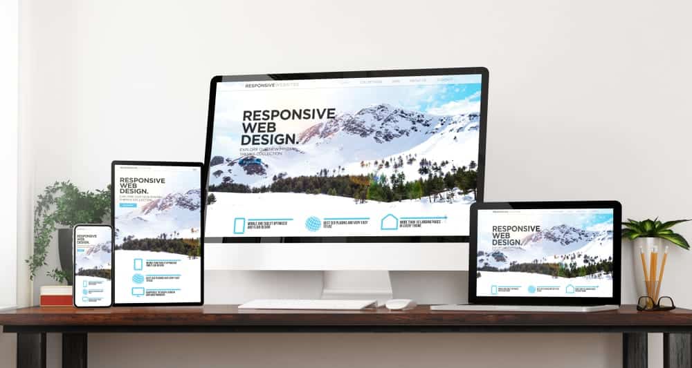
The number of people on the internet using mobiles and tablets is growing every year. They currently account for more than 56% of the world’s total internet usage. That is why it is vital to have a responsive web design. Responsive web design is one that can adapt to any device and user behavior.
Here are 11 powerful examples of responsive web design to inspire any web designers in Liverpool.
Dropbox
Dropbox has one of the most responsive web designs out there. The website uses fluid visuals and grids to accommodate all types of devices. Everything from the font colors to the image orientation changes when you shift from a desktop to a mobile device.
Dribble
Dribble is another excellent example of a responsive web design. Their website design consists of a fluid grid, which changes from five columns on PCs to two columns on mobile devices.
GitHub
One great thing about GitHub’s web design is that they offer consistent service and experience regardless of the device. For example, the page layout changes from two-column to single-column when you shift from desktops to mobile devices. Yet, the services and information are all there.
Klientboost
Klientboost also does a fantastic job by promoting the fast loading time of their website. Moreover, they maintain the overall look and design of their site while also tailoring it for different devices.
Magic Leap
Magic Leap adopts a mobile-first web design. This makes their website suitable for the growing number of people who are on mobile devices. Plus, their site loads faster than average, even with a 3G connection.
Shopify
Shopify ensures a consistent user experience across all devices. The only thing change you’ll see is with the location of the call-to-action button. Everything else adapts to the ratio of your screen.
Smashing Magazine
Smashing Magazine is another website that tailors the layout of their page based on your devices. When you’re on a desktop, you’ll see a full menu on top with a two-column layout. However, in a mobile device, the changes you’ll see are a condensed menu and a single column layout.
Slack
Slack is a simple and easy-to-use website with responsive web design. They have a flexible grid design that adapts to the different shapes and sizes of your device.
Treehouse
Treehouse menu bars get smaller as you shift to a mobile device to adapt to a smaller screen. Their web design features a four-column menu on a desktop, two on a tablet, and finally one on a smartphone.
WillowTree
Like the websites above, WillowTree also features a full menu icon on a desktop that gets condensed on smaller devices. They also follow a two-column view on desktops, which changes to a single column view. Besides that, the location of the call-to-action button also shifts from the side to the bottom.
WIRED
WIRED has to be one of the most dynamic websites on the internet. Their website features multiple columns on desktops, which changes into a single column on mobile devices. One of the best things about their website is the flexible images. The images on a desktop are usually squares, but in mobile devices, they are cropped to a 16:9 ratio.
Conclusion
Thus these are 11 of the most powerful examples of responsive web designs. You can check them out and have a better idea about how a responsive web design looks like.


